Could movies possibly be any less cool than they are right now, and could they possibly look any uglier?
You’d have to ask the flocks of film students brainstorming “content” as they herd through USC or AFI or Tisch – regardless of sadistic tuitions and inhuman debt – compelled by some foggy myth of a time when these (mainly) white male cultural institutions / sinkholes sculpted artists and tradesmen into thick-skinned auteurs primed for the corridors of commerce and CAA, backlots and Burbank, declaring proudly for anyone who will listen: I have cinematic style! I have visual flair!
Or ask the supposed anti-Academy renegade cineastes, those wish-they-were John Waters or Derek Jarmans or Kelly Reichardts, the fearless ones with skewed perspectives and reckless narratives who somehow take the higher, harder path (learning by doing, growing by failing) thereby gracing film history with a patina of defiance and resistance and visual integrity. Ask them, please – if they’re currently accepting calls – why the fuck is everything so ugly?
Or direct the question elsewhere, to fine artists of other modes and mediums – fashion, painting, sculpture, dance, music, theater – to designers and creators untethered to moviemaking and its historical baggage, to the albatrosses of box office and bankability. Google “Rei Kawakubo 2019 Runway” and then ask yourself if you’ve seen anything remotely as raw, fresh and unfuckwithable in independent or mainstream cinema lately.

The rebuttal to this critique is to shout from the back of the internet, “What about Blade Runner 2049, though? What about Roma? What about 12 Years A Slave?” or to dismiss it as subjective snobbery (a word I find far less pejorative than everyone else). The fact is, though, that merely listing a few stray positive counterexamples doesn’t undo a greater downward spiral. Exceptions to rules are simply that: exceptions.
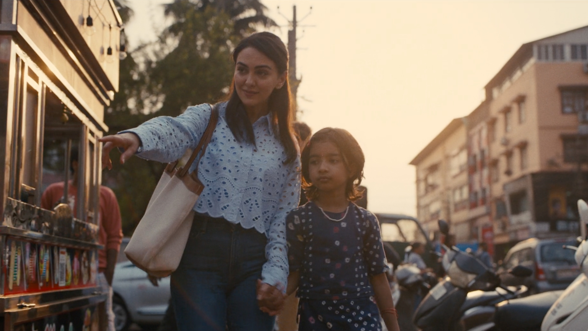
The most common causes for outrage in Hollywood lately are casting and awards – inevitably someone is snubbed or subbed, or gets too much credit, or not enough – but these issues ignore the bigger, blunter bummer: what the movies actually look like. And what they look like is bland. Riskless. Verging on indistinguishable. A teary Sundance favorite, blockbuster Marvel sequel, and hyped Hulu Original have all come to resemble one another, unified by the same tedious trait: expensiveness. Each obeys the same dictum: look as costly as possible. Not in a deliberately decadent or opulent way, just … expensive.
It’s hardly a hot take to point out that, historically, money corrupts. So why would it be any different with art and aesthetics? Slickness and high definition are meager substitutes for personality and expression. This has nothing to do with analog versus digital, or a naive deification of cheapness. Shoot on 35 millimeter film or a state of the art digital IMAX rig or some kitschy vintage Bolex if you must, but don’t be shocked when a weirdo dropout with a hint of vision makes a movie using nothing but an old iPhone and natural light and wows the European festival circuit.
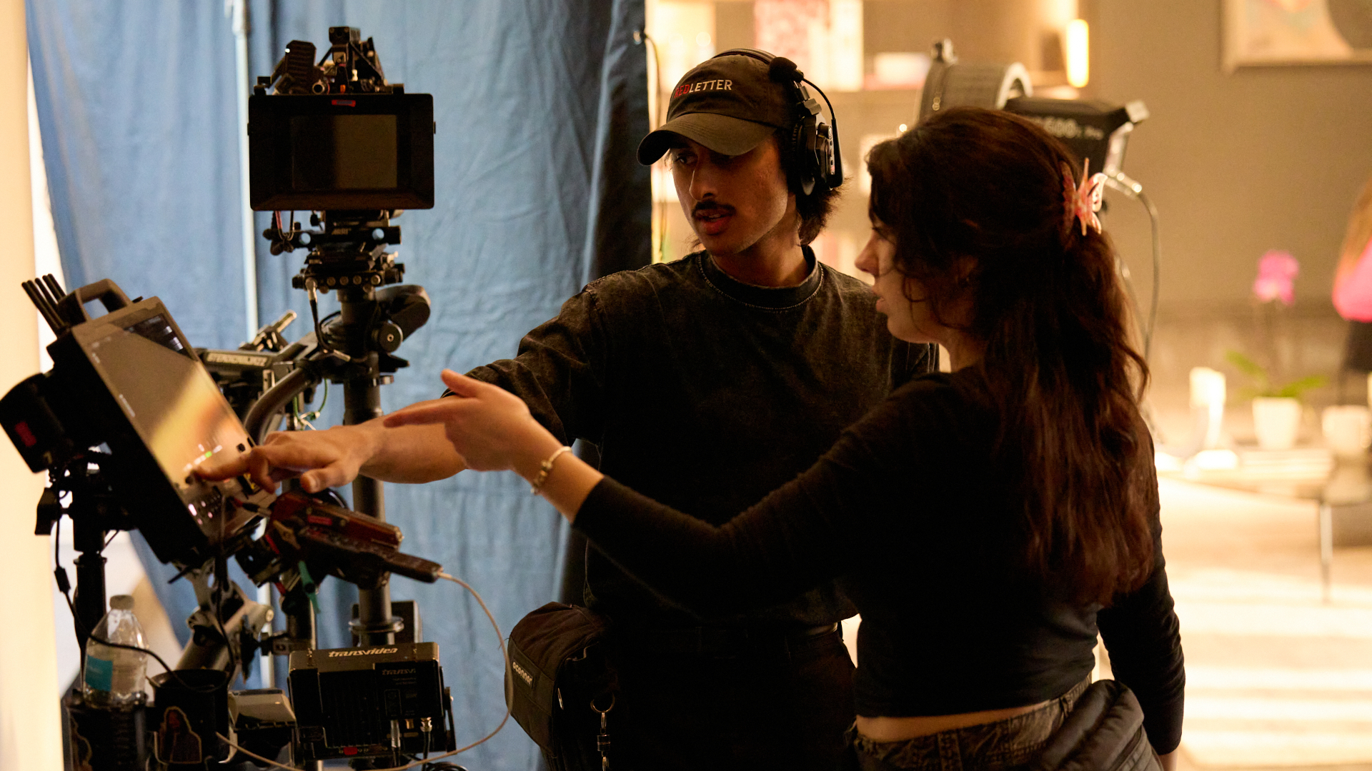
This isn’t about artificial deprivation – I want my D.P. to have access to whatever equipment he feels is necessary to perform at his peak ability, and same goes for everyone else on the crew – but does the whole industry have to be so fucking rabidly capitalistic? So blinded by the idea that professionalism means poshness, that bloated budgets make better art?

It’s testament to how fucked the current state of affairs is that being considered “underground” is more a liability than a credibility. Let’s look back at mumblecore. It’s now a punchline because of its emo narcissism, plotless hipsters and endless whiteness, but it was also the closest any modern American film movement has come to something like Dogme 95. Yes, too many of the movies were people without problems cosplaying ennui, but the reality was a generation of filmmakers defying high production values and star meters to make humble, intimate narratives that were actually watched and respected internationally. It sounds unthinkable in 2019.
Inevitably, the major players abandoned frugality once bigger budgets came courting. Was being televisually employed and competently helming union crews their true ambition, and mumblecore simply a youthful accident along the way? History can be a harsh judge, but it will never not be chic do your own fucking thing and create your own world in place of the ones that won’t have you. Mumblecore films are not ugly; they have an innate grace and je ne sais quoi, unafraid of alienating or boring an audience brainwashed by major motion picture splash. This fleeting, messy micro-movement may have run its short course but how long will we have to wait for the next wave of New Wavers, No Wavers, or Angry Young Cassavetes Creeps?
If I had to make a prediction based solely on the key art for most films flowing through the dominant streaming services lately, I’d say probably … forever?

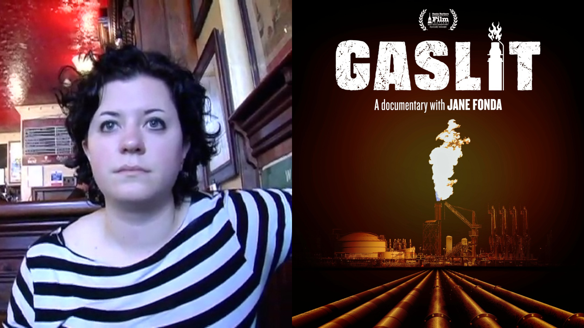
Where does one even begin with key art? Laughable at best, it’s mainly just lonely to look at the tasteless depths of slapdash schlock these tiny, vulgar e-posters have become. Faces staring into middle distances, hacked cut-and-paste jobs, plastic promotional stills, awkward headshots of actors who have less than 12 minutes of screen time but the highest number of IMDb credits – this is what is supposed to compel us to “click.” It hurts to have to remember how fucking sick movie posters used to be, especially in countries where designers could take liberties with concept rather than be forced to visually explain the plot so condescendingly as if the viewer were braindead. Are we nothing more than focus groups in miserable Culver City conference rooms expressing consensus approval of familiar color, shape and line?

Not that the films themselves are much bolder. Everything is shot like a commercial for an eco-friendly sports utility vehicle or new Apple product. Which cliché offends most? Lens flare belongs in twee major-studio indies – and whatever Terrence Malick is on about now – and nowhere else. I don’t understand; they read as beautiful because of … rainbows? It’s about as profound as student photographs of stairway railings casting shadows on concrete walls. And establishing shots? I guess if you feel you still have to remind people Cheers is a bar in a real city and not just floating in the middle of the ocean or some shit. How old fashioned. You don’t need to see multiple images of the Chicago skyline, or a drone view of redwood trees, to grasp that a story is set in Chicago or a Northern California forest. It’s like location scouting for a film that’s already been distributed.
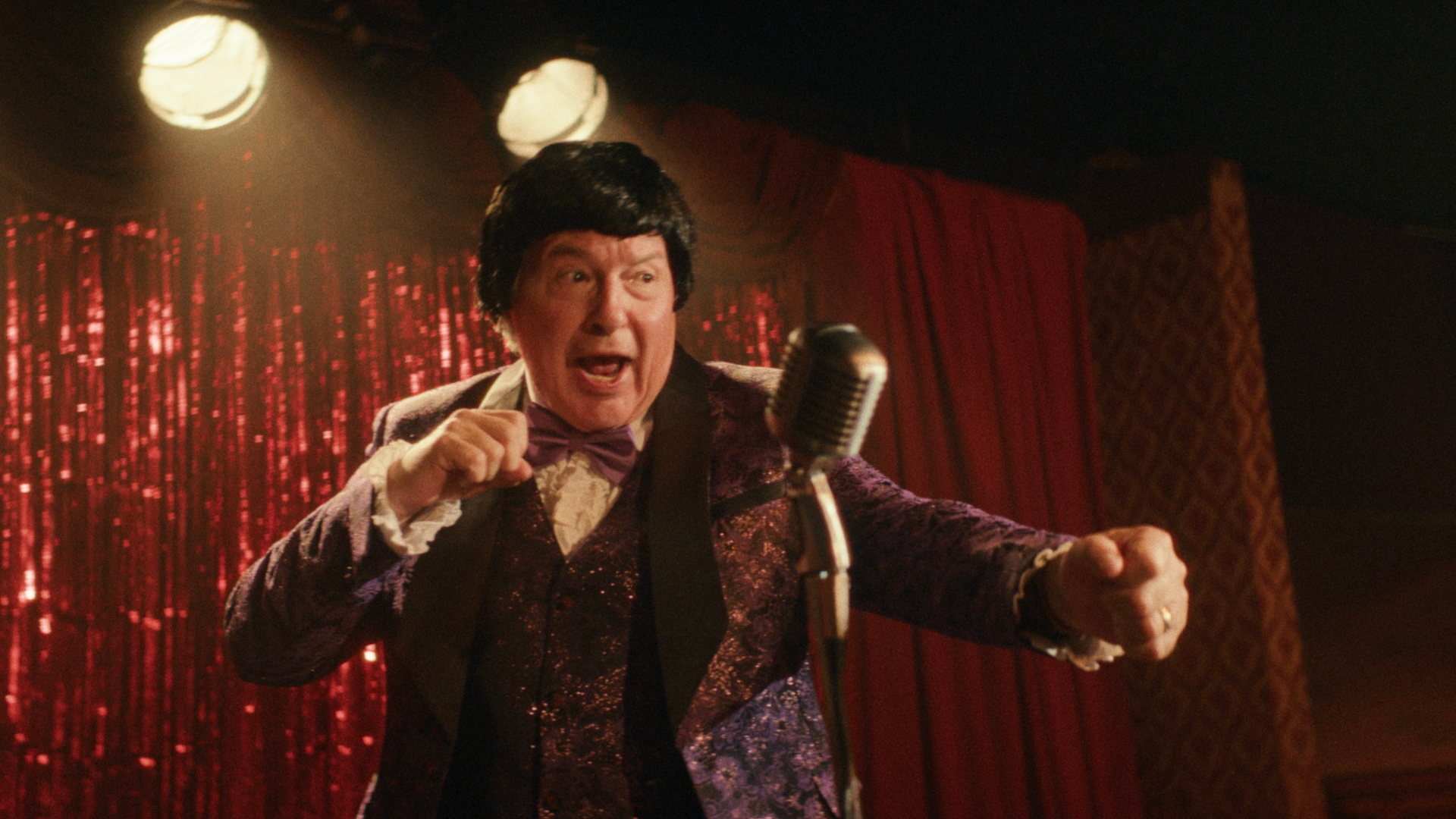
Another visual component of the modern ugliness plague is color correction. This is the one that totally defeats me. Overlit, oversaturated and spectrum-boosted like it’s trying desperately to distract hyperactive children from having meltdowns while they wait for their parents to pick them up from daycare. Or the other color correction mortal sin: the wan, steely gray-blue treatment overused in every “serious” drama, cop/crime story, or phoned-in urban thriller. Such obsession with contrast. We get it: these characters are tired and have lost their luster (literally) because they’re a single parent or it’s a grim day on the force or someone’s hiding drugs in a Jansport, etc. It’s grittiness on autopilot; which, ironically, reads as the opposite of gritty. It’s like using sepia tone or grainy black-and-white for a flashback – how fucking hateful of a hack do you have to be? Why would we, as viewers of thousands of movies in our lifetime, need to be told how a flashback works?
Ugliness takes many forms, just like beauty remains in the eye of the beholder. A “beautifully shot” film about beautiful people in a beautiful setting wearing beautiful clothes can, in the wrong hands – or, even, most hands – be uglier than Divine eating dog shit. True ugliness – the perverse, depraved, unhinged, unmediated kind – isn’t ugly at all. It’s the infusion of chaos that’s everywhere in life, and essential in art.