Chris Caldwell is a writer-director based in Seattle, WA, where with Zeek Earl he founded the production company Shep Films. Caldwell and Earl’s first short film, In the Pines, premiered at SXSW in 2012. Prospect, their feature debut now in theaters, is based on their short of the same name which also premiered at SXSW in 2014.
Alex Park is a Seattle-based visual artist. He has been a long-time collaborator with Zeek Earl Chris and Caldwell, directing and shooting commercials for their production company Shep Films. He was the graphic design lead for Prospect during pre-production and camera operator during production.
Chris Caldwell, co-writer and co-director: Personally, one of the most compelling things about science fiction is that feeling of getting dropped headfirst into an unfamiliar world. For Prospect, the new sci-fi feature I co-wrote and co-directed with Zeek Earl, our aim was to create a rich and detailed original universe, but we wanted to explore it with a light touch, keeping the perspective as observational as possible.
This meant that everything in front of the camera needed to reveal something about the world. The goal was to keep stilted exposition out of the characters’ mouths and make the world as self-evident as possible, for it to be revealed to the audience through a dense tapestry of visual details.
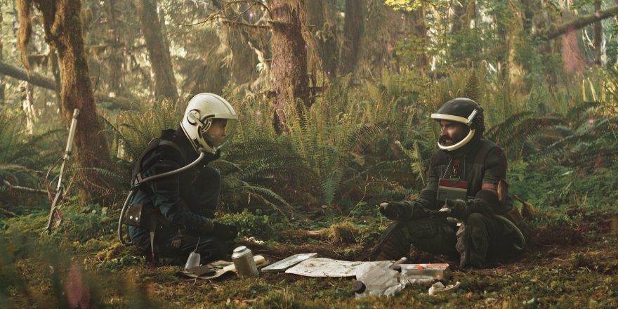
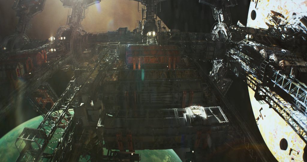
We wanted to establish a world that felt expansive and alive, but which ultimately functioned as the backdrop to a more intimate story, tethered to the experiences of our young female protagonist, Cee (Sophie Thatcher) as we follow her strange, survival-induced coming of age. The world becomes incidental to the story, rather than purpose-built for it, and feels like it extends well beyond the edges of the film.
When you are creating a completely fantastical universe, production design is one of the most impactful ways of making it come to life. In real-world settings – both contemporary and historical – an existing spectrum of artifacts to anchor us to where we are, but in an imagined universe, you have to invent your own. We wanted this fictional world to have a palpable sense of culture, history, art and economics that felt deep and complex. Details such as warning labels, instruction manuals, fine print, logos and advertisements were key to creating the illusion that the production design was a product of a reality, rather than purpose-built for a film.
I asked Alex Park, our lead graphic designer, to describe how he used the graphic elements seen throughout the film to help create the world of Prospect.
Alex Park, graphic design lead: At the start of the design process, Chris and Zeek gave me some images that helped define the graphic language of the world they wanted me to create in Prospect. A few photos in particular stood out — a Soviet shuttle inside an abandoned hangar in Kazakhstan, and an original high-resolution photo from inside the Apollo spacecraft.
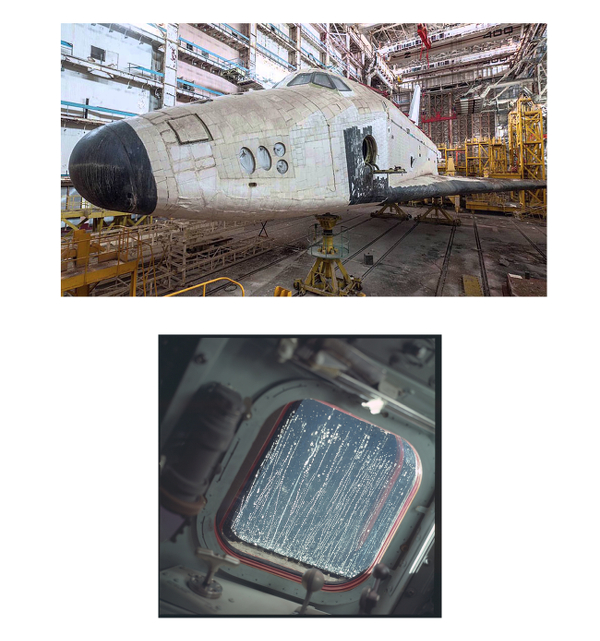
Both images seem to ride the line between future and past, expressing the progressive spirit of space travel, but grounded by utilitarian and economic realities. It reminded me of something astronaut Alan Shepard said about how every part of his spacecraft was built by the lowest bidder. These two images quickly became the filter that all other reference imagery flowed through.
We nicknamed the aesthetic “painted rust,” a reference to the industrial output generated at breakneck speed by the USSR. For me, the “painted rust” aesthetic felt like it came from an alternate future where the USSR had won the space race and the Cold War, and continued to explore the galaxy.
Applying this aesthetic was like walking a tightrope. Leaning too far in one direction put us in danger of regressing to overly nostalgic takes on the classic sci-fi movies we adored (Blade Runner, Alien, 2001: A Space Odyssey); leaning too far in the other direction put us in danger of taking on the slick, sterile, pre-packaged minimalism that characterizes a lot of graphic design in contemporary science-fiction.
Though Prospect entirely takes place on the uncivilized frontier of the galaxy, Chris and Zeek still wanted to there to be evidence of civilization buried in the corners. Pop culture, religion, politics and consumer goods were all facets of humanity they wanted the audience to encounter. The prospectors flocking to California during the Gold Rush were working and dying in Levi Strauss denim. We wanted to represent that kind of reality.
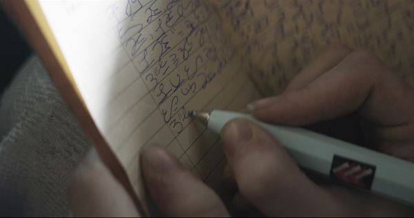
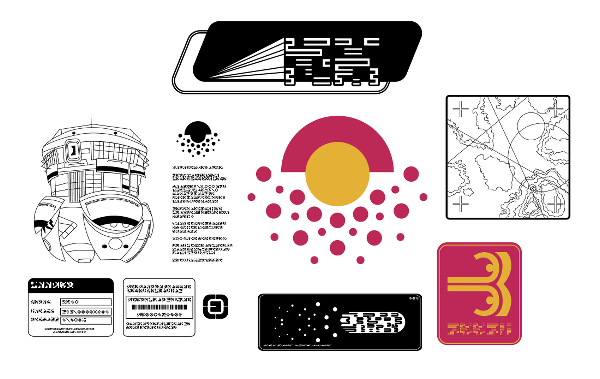
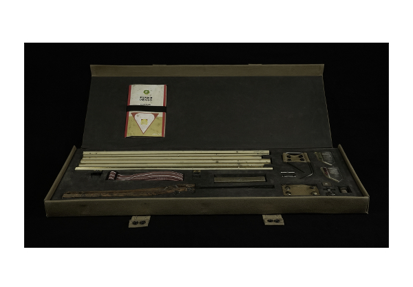
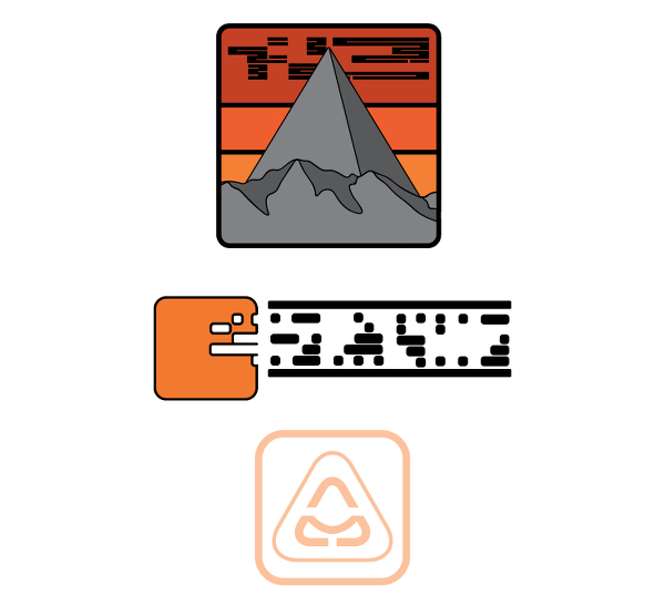
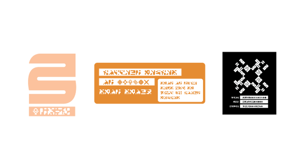
Before we could develop anything, the first step was to create an in-world alphabet and numeric system, which was developed by concept artist Laurie Greasley. The alphabet had a formal calligraphic character system as well as a machine glyph system, and we would later develop a third alphabet system suited for handwriting.
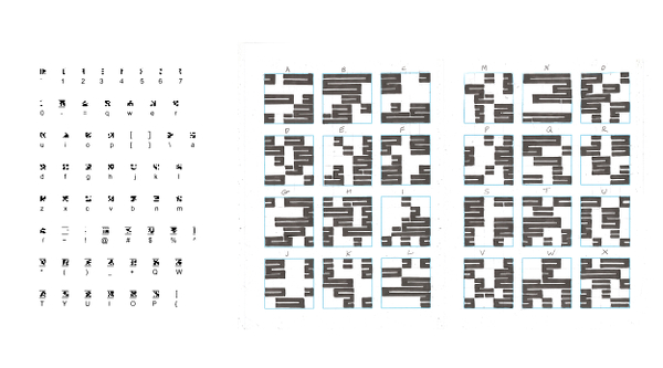
A completely original alphabet reinforced the otherworldliness of Prospect’s backdrop, but also meant that every new font would have to be made from scratch — no tweaking existing fonts as a template to create variation.
In addition to the alphabet, we also had to establish basic in-world iconography and semiotic standards. Tossing out the Roman alphabet established a paradigm where we couldn’t assume anything was a logical progression from our current state of humanity.
As a troubleshooting exercise, Chris and Zeek would challenge us to imagine what the idea in question would look like after several cycles of dark age and renaissance. Retaining a sense of unfamiliarity was key to the universe, and this dark age/renaissance thought experiment wiped the slate clean.
For example, we didn’t want to use the red cross to symbolized medical care or represent directionals in the form of an arrow. We were challenged to rethink the origins of the universally understood iconography we take for granted today.

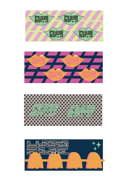
Our first design task was the long-haul space freighter where the film begins. To create the freighter company’s logo, we imagined that they had once been a Royal Caribbean-esque cruise line that had had to switch their business model towards commercial transport to keep the business viable.

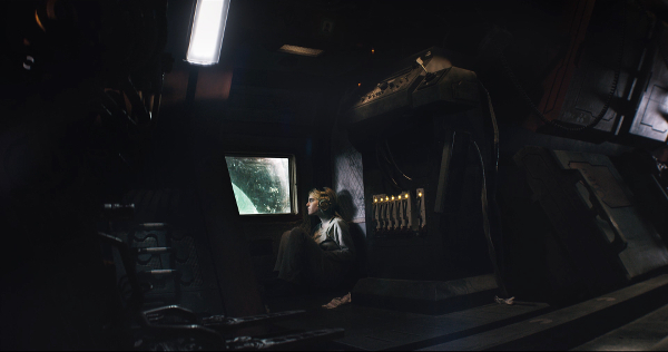
In our first glimpse of Cee, she is hiding in the corner of a shipping compartment. This is a crude, industrial environment, the kind of place a child shouldn’t be. To add evidence of life, we layered an assortment of in-world graffiti and a small portrait of a religious figure where the crane operator would be standing during loading and unloading procedures.
The freighter’s exterior shots feature long rows of stacked shipping containers. Rather than develop a single corporate brand for the shipping containers, it was important for us to showcase an assortment of brands from a variety of origins. Not only does this subtly broaden the viewer’s sense of an interconnected world, it more accurately mirrors the messy reality of commercial shipping.

The drop pod was the most detailed set in Prospect: a cramped spacecraft with the barebones functionality of an Apollo command module that serves as home for Cee and her blue-collar father, Damon, on their long-haul journey. Another detail buried in the story is that this pod is a rental – essentially the space equivalent of a U-Haul – so the branding in the pod needed to evoke this feeling.
Production designer Matt Acosta directed us towards old photos of luxury RVs for reference and we drew on our personal experiences of having to rent large trucks from rental companies.
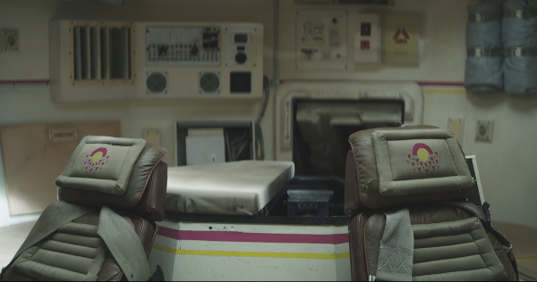
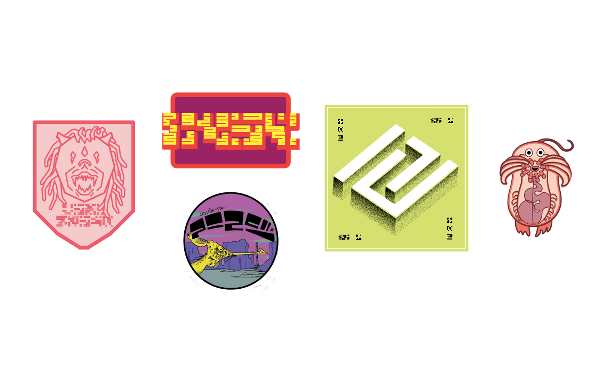
The stickers surrounding Cee’s cubby are meant to carve out a sliver of personal space in the cramped pod – her “room” so to speak – the same way teenagers adorn their walls with posters, or their lockers with stickers and magazine cutouts. When deciding what stickers in Prospect looked like, we recalled the stickers and temporary tattoos we’d get from those red vending machines at roller rinks and gas stations when we were kids.
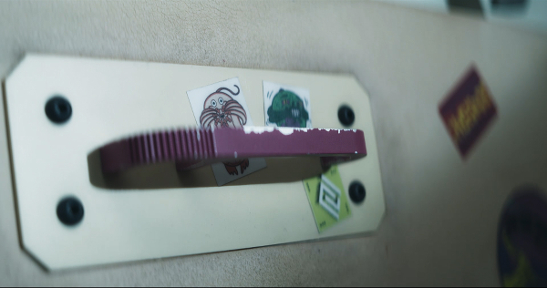
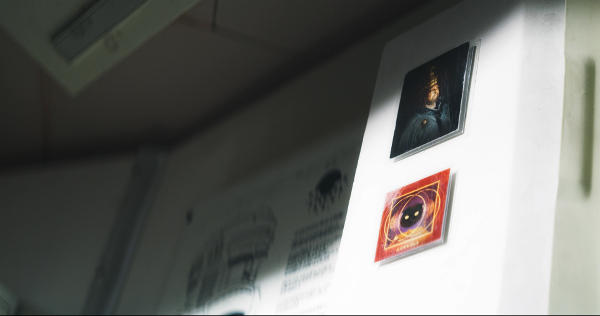
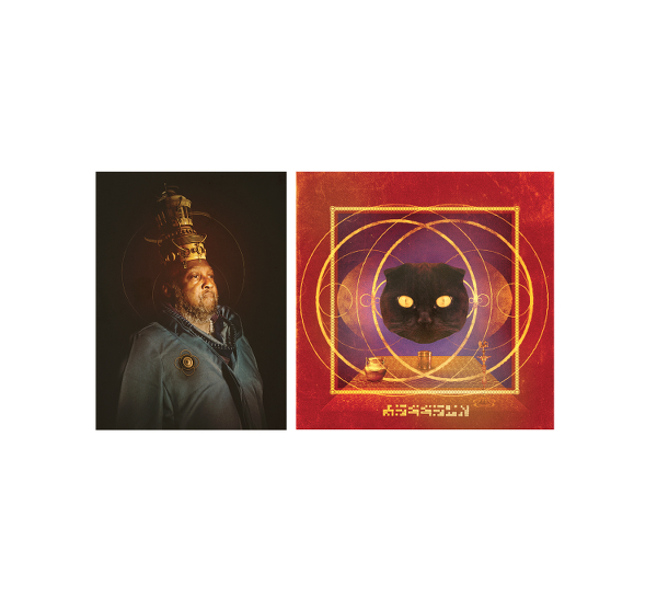
The iconic portraits above the door referenced traditions of decorating the threshold of a home with blessings from a saint or good luck from a horseshoe.
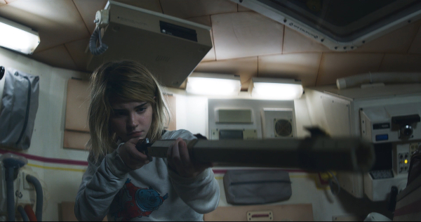
Inside the pod, the viewer is introduced to the concept of Prospect’s firearms, called “throwers.” Every homestead on the frontier had a Winchester Model 1873, but Acosta’s vision for Damon’s thrower was less heritage rifle and more like an off-brand shotgun Damon picked up from the interstellar Walmart.
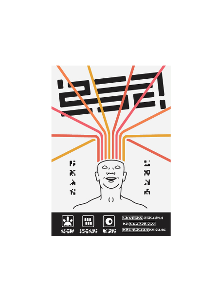
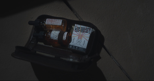
Space travel in Prospect is a long and arduous affair. No stasis sleep pods or jumps to warp speed. Damon deals with this by knocking himself out with a dubious sedative, which he has to counter with a stimulant gum that he chews incessantly. The design of the “stim gum” packaging took its cue from the suspicious-looking caffeine products you find at gas stations on major trucking highways.
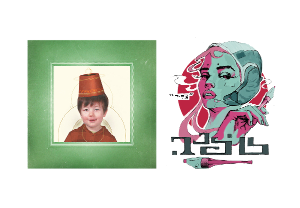
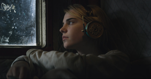
Inside the pod, we get a closer view of Cee’s headphones and watch. The music in the headphones is loaded via cylindrical media, featuring album art (later we see that Cee has peeled off one of the album covers and stuck it on the back of her helmet).
For the watchface, Zeek sifted through piles of used Casio watches for inspiration. The final form of the watch made it very natural to intuit the branding.

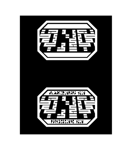
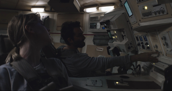
We were given the 2D layout of the pod’s control panel and provided a detailed sequence of actions that Damon would be executing during the landing scene. This enabled us to create a logical flow on the screens that reflected each step in this complicated flight sequence.
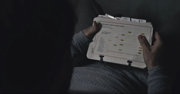
Damon is not a trained pilot. He’s just like any of us who have rented a large box truck and are feeling intimidated about backing it down a narrow street. To communicate this idea, we created an operator’s manual that Damon has to reference when flying the craft. It’s the kind of manual you’d find shoved in the back of a glovebox, and was intended to evoke the dense, vexing type of instructions written by an engineer.
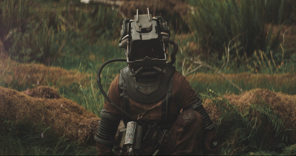
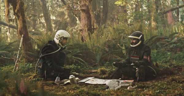
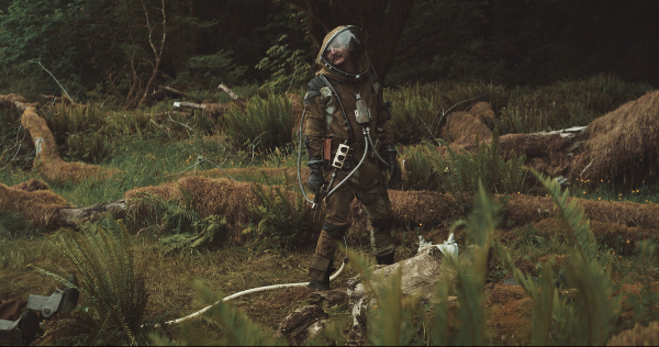
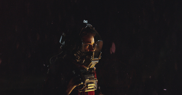
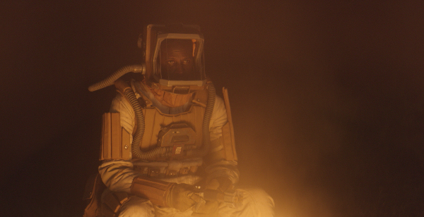
Once on the Green Moon, we see Cee and Damon fully kitted out in their suits for the first time. The idea was that their suits were created by the same manufacturer, but years apart, as if Damon had found a brand he trusted and outfitted Cee with the same kit he purchased for himself decades earlier. The uniformity of Cee and Damon’s matching suits is contrasted by the suits of Ezra and Number Two—bandits who have been lurking in the forest for months—which have the look of professional grade gear that has become outdated since issue and bear the scars of years of repairs to keep them functioning.
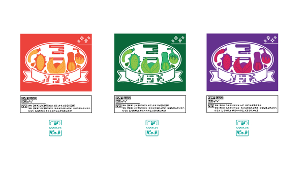
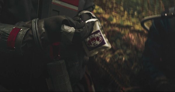
Chris and Zeek wanted to acknowledge some of the more mundane elements of expedition, including how one eats inside an environmental suit. So we developed “slurry packs,” nutrition sucked through tubes, featuring brightly colored branding indicating that this is an off-the-shelf consumer product.
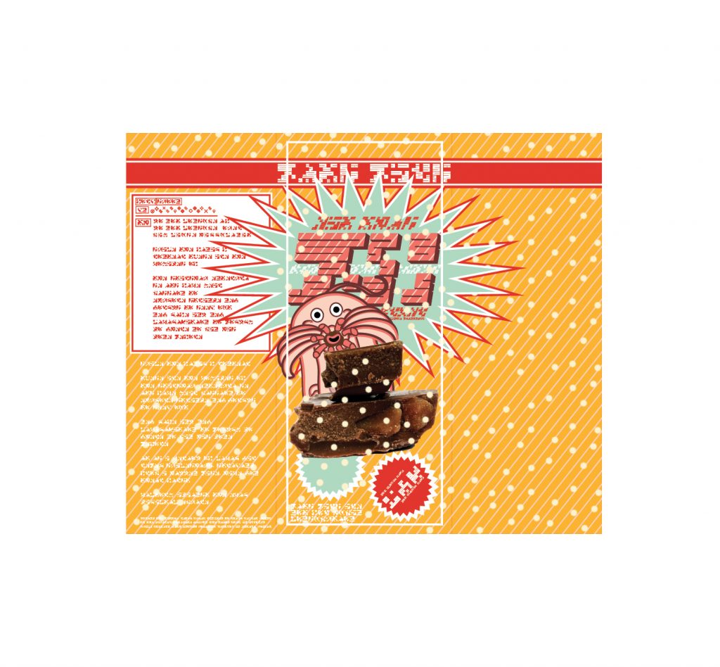
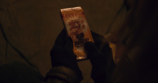
Later in the film, we visit an abandoned camp from a corporate-backed mining operation. The sparse accommodation was given a touch of flavor by the presence of candy bars.
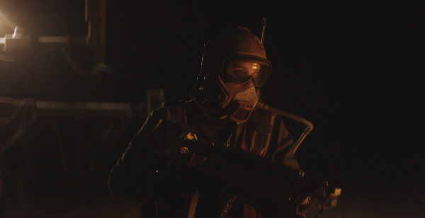
The mercenaries in the final act of the film opened up a paramilitary dimension in the world of Prospect and each character featured a unique backstory that needed to be felt through visual touchstones.
The tumultuous backstory of Inumon, for example, was boiled down to a coat-of-arms that adorned her bum flap, indicating a higher stature in a political regime previously in her career.

Mikken was seen as being a more purely military figure which was represented in the drab, functional branding of his suit and breather, whereas Jack’s helmet was plastered with stickers collected over his travels like a steamer trunk from the Roaring Twenties.

Utilizing graphic design as a main component of the production design strategy was key in imbuing the Prospect universe with a sense of limitless depth. An object within a film can be connected to the world by virtue of its basic form, color and texture. But for many of the objects in Prospect, we found that these considerations were only half of the battle. The rest came with that final layer of graphic design to truly integrate the prop, costume or set piece into the world.